Adaptive Layouts
Adaptive Layouts
Libadwaita provides a number of widgets that change their layout based on the available space. This can be used to make applications adapt their UI between desktop and mobile devices.
Clamp
AdwClamp has one child and constrains its maximum size while still
allowing it to shrink. In other words, it allows the child to have padding when
there’s enough space, and to remove them otherwise.
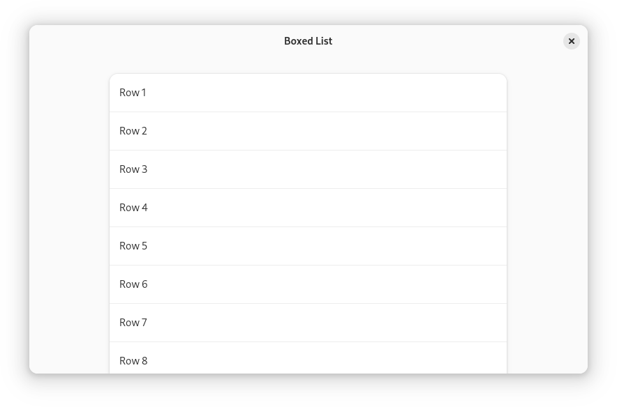
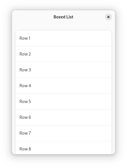
This is commonly used for patterns such as boxed lists:
<object class="AdwClamp">
  <property name="child">
    <object class="GtkBox">
      <property name="orientation">vertical</property>
      <property name="margin-top">24</property>
      <property name="margin-bottom">24</property>
      <property name="margin-start">12</property>
      <property name="margin-end">12</property>
      <property name="spacing">24</property>
      <child>
        <object class="GtkListBox">
          <property name="selection-mode">none</property>
          <style>
            <class name="boxed-list"/>
          </style>
          <!-- rows -->
        </object>
      </child>
      <!-- more lists -->
    </object>
  </property>
</object>
See also: AdwClampLayout, AdwClampScrollable.
Dialogs
AdwDialog is an adaptive dialog container. It can be presented as a
centered floating window or a bottom sheet, depending on the size of its parent window.
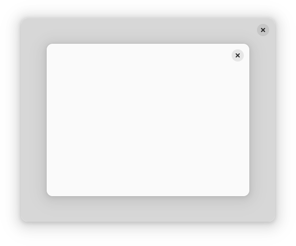
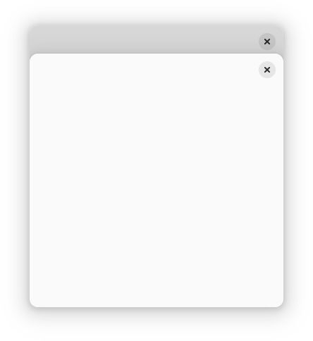
To use AdwDialog, your window must be AdwWindow or
AdwApplicationWindow.
Breakpoints
AdwBreakpoint allows applications to restructure UI in arbitrary ways
depending on available size. Breakpoints can be used with AdwWindow,
AdwApplicationWindow, AdwDialog or AdwBreakpointBin.
When using breakpoints, the widget containing them will have no minimum size,
and the application must manually set the GtkWidget:width-request
and GtkWidget:height-request properties, indicating the smallest
supported size.
All of the examples below use breakpoints.
View Switcher
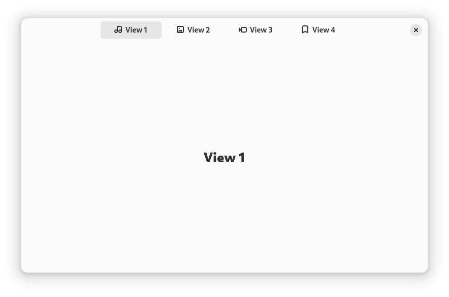
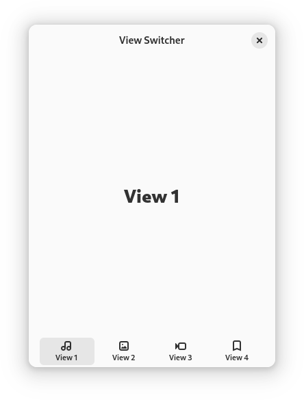
The AdwViewSwitcher and AdwViewSwitcherBar widgets implement an
adaptive view switcher.
They are typically used together, providing desktop and mobile UI for the same
navigation: a view switcher in the header bar when there’s enough space, or a
view switcher in a bottom bar otherwise. An AdwBreakpoint is used to
switch between them depending on available width.
<object class="AdwWindow">
  <child>
    <object class="AdwBreakpoint">
      <condition>max-width: 550sp</condition>
      <setter object="switcher_bar" property="reveal">True</setter>
      <setter object="header_bar" property="title-widget"/>
    </object>
  </child>
  <property name="content">
    <object class="AdwToolbarView">
      <child type="top">
        <object class="AdwHeaderBar" id="header_bar">
          <property name="title-widget">
            <object class="AdwViewSwitcher">
              <property name="stack">stack</property>
              <property name="policy">wide</property>
            </object>
          </property>
        </object>
      </child>
      <property name="content">
        <object class="AdwViewStack" id="stack"/>
      </property>
      <child type="bottom">
        <object class="AdwViewSwitcherBar" id="switcher_bar">
          <property name="stack">stack</property>
        </object>
      </child>
    </object>
  </property>
</object>
You may need to adjust the breakpoint threshold depending on the number of pages in your application, as well as their titles.
Split Views
Libadwaita provides two containers for creating multi-pane layouts that can
collapse on small widths: AdwNavigationSplitView and
AdwOverlaySplitView.
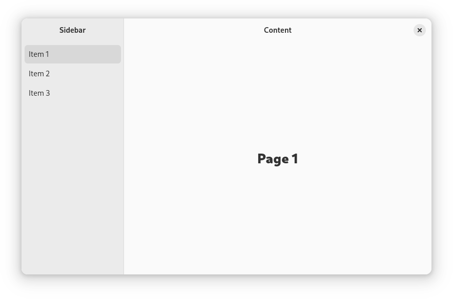
Both widgets have two children: sidebar and content. They are typically used
together with a AdwBreakpoint toggling their collapsed property for
narrow widths.
Navigation Split View
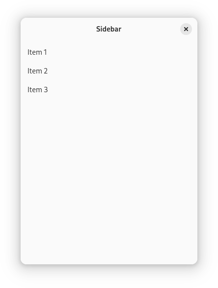
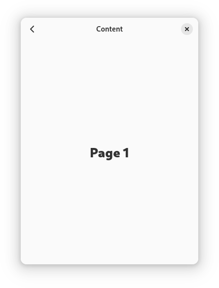
AdwNavigationSplitView turns into an AdwNavigationView when collapsed,
containing the sidebar as the root page and content as its subpage. Only
AdwNavigationPage can be used for both the sidebar and content.
<object class="AdwWindow">
  <child>
    <object class="AdwBreakpoint">
      <condition>max-width: 400sp</condition>
      <setter object="split_view" property="collapsed">True</setter>
    </object>
  </child>
  <property name="content">
    <object class="AdwNavigationSplitView" id="split_view">
      <property name="sidebar">
        <object class="AdwNavigationPage">
          <property name="title" translatable="yes">Sidebar</property>
          <property name="tag">sidebar</property>
          <property name="child">
            <object class="AdwToolbarView">
              <child type="top">
                <object class="AdwHeaderBar"/>
              </child>
              <property name="content">
                <!-- sidebar -->
              </property>
            </object>
          </property>
        </object>
      </property>
      <property name="content">
        <object class="AdwNavigationPage">
          <property name="title" translatable="yes">Content</property>
          <property name="tag">content</property>
          <property name="child">
            <object class="AdwToolbarView">
              <child type="top">
                <object class="AdwHeaderBar"/>
              </child>
              <property name="content">
                <!-- content -->
              </property>
            </object>
          </property>
        </object>
      </property>
    </object>
  </property>
</object>
AdwHeaderBar will automatically provide a back button, manage window controls
and display the title from its AdwNavigationPage.
Overlay Split View
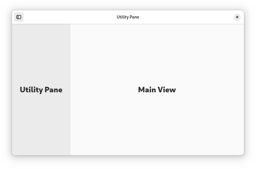
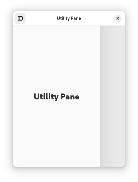
AdwOverlaySplitView shows the sidebar as an overlay above the content when
collapsed. It’s commonly used to implement
utility panes,
but can be used with split header bars as well.
<object class="AdwWindow">
  <child>
    <object class="AdwBreakpoint">
      <condition>max-width: 400sp</condition>
      <setter object="split_view" property="collapsed">True</setter>
    </object>
  </child>
  <property name="content">
    <object class="AdwToolbarView">
      <property name="top-bar-style">raised</property>
      <child type="top">
        <object class="AdwHeaderBar">
          <child type="start">
            <object class="GtkToggleButton" id="show_sidebar_button">
              <property name="icon-name">sidebar-show-symbolic</property>
              <property name="active">True</property>
            </object>
          </child>
        </object>
      </child>
      <property name="content">
        <object class="AdwOverlaySplitView" id="split_view">
          <property name="show-sidebar"
                    bind-source="show_sidebar_button"
                    bind-property="active"
                    bind-flags="sync-create|bidirectional"/>
          <property name="sidebar">
            <!-- utility pane -->
          </property>
          <property name="content">
            <!-- main view -->
          </property>
        </object>
      </property>
    </object>
  </property>
</object>
To make the utility pane permanently visible on desktop, and only allow to show and hide it on mobile, you can toggle the button’s visibility with your breakpoint:
<object class="AdwBreakpoint">
  <condition>max-width: 400sp</condition>
  <setter object="split_view" property="collapsed">True</setter>
  <setter object="toggle_pane_button" property="visible">True</setter>
</object>
<!-- ... -->
<object class="GtkToggleButton" id="toggle_pane_button">
  <property name="icon-name">sidebar-show-symbolic</property>
  <property name="active">True</property>
  <property name="visible">False</property>
</object>
Triple Pane Layouts
Both split views can be used for creating triple pane layouts, via nesting two of the views within one another. The inner view can be placed as the sidebar or content widget in the outer view, depending on how you want to handle collapsing.
An example of a triple-pane layout with the an AdwNavigationSplitView nested
within another AdwNavigationSplitView‘s sidebar:
<object class="AdwWindow">
  <child>
    <object class="AdwBreakpoint">
      <condition>max-width: 860sp</condition>
      <setter object="outer_view" property="collapsed">True</setter>
      <setter object="inner_view" property="sidebar-width-fraction">0.33</setter>
    </object>
  </child>
  <child>
    <object class="AdwBreakpoint">
      <condition>max-width: 500sp</condition>
      <setter object="outer_view" property="collapsed">True</setter>
      <setter object="inner_view" property="sidebar-width-fraction">0.33</setter>
      <setter object="inner_view" property="collapsed">True</setter>
    </object>
  </child>
  <property name="content">
    <object class="AdwNavigationSplitView" id="outer_view">
      <property name="min-sidebar-width">470</property>
      <property name="max-sidebar-width">780</property>
      <property name="sidebar-width-fraction">0.47</property>
      <property name="sidebar">
        <object class="AdwNavigationPage">
          <property name="child">
            <object class="AdwNavigationSplitView" id="inner_view">
              <property name="max-sidebar-width">260</property>
              <property name="sidebar-width-fraction">0.38</property>
              <property name="sidebar">
                <!-- sidebar -->
              </property>
              <property name="content">
                <!-- middle pane -->
              </property>
            </object>
          </property>
        </object>
      </property>
      <property name="content">
        <!-- content -->
      </property>
    </object>
  </property>
</object>

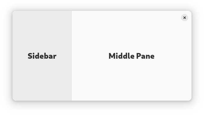
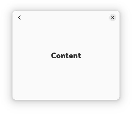
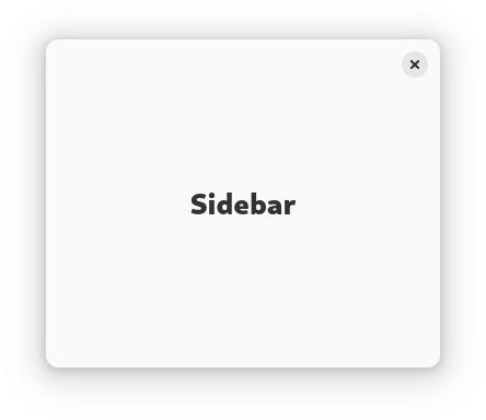
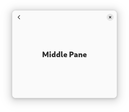
When only the outer split view is collapsed, either the content is visible or the sidebar and middle pane are visible. When both split views are collapsed, only one pane is visible at a time.
An example of a triple-pane layout with the an AdwNavigationSplitView nested
within an AdwOverlaySplitView‘s content:
<object class="AdwWindow">
  <child>
    <object class="AdwBreakpoint">
      <condition>max-width: 860sp</condition>
      <setter object="outer_view" property="collapsed">True</setter>
    </object>
  </child>
  <child>
    <object class="AdwBreakpoint">
      <condition>max-width: 500sp</condition>
      <setter object="outer_view" property="collapsed">True</setter>
      <setter object="inner_view" property="collapsed">True</setter>
    </object>
  </child>
  <property name="content">
    <object class="AdwOverlaySplitView" id="outer_view">
      <property name="max-sidebar-width">260</property>
      <property name="sidebar-width-fraction">0.179</property>
      <property name="sidebar">
        <!-- sidebar -->
      </property>
      <property name="content">
        <object class="AdwNavigationSplitView" id="inner_view">
          <property name="min-sidebar-width">290</property>
          <property name="max-sidebar-width">520</property>
          <property name="sidebar-width-fraction">0.355</property>
          <property name="sidebar">
            <!-- middle pane -->
          </property>
          <property name="content">
            <!-- content -->
          </property>
        </object>
      </property>
    </object>
  </property>
</object>
When only the outer split view is collapsed the middle pane and content are visible, and the sidebar can be overlaid above them.
Tabs
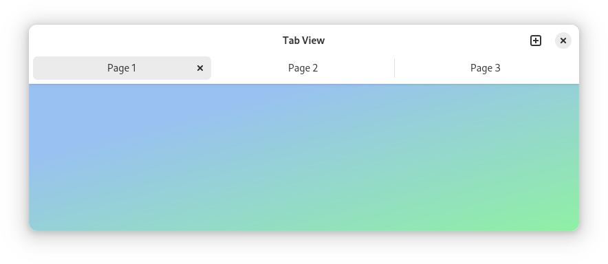
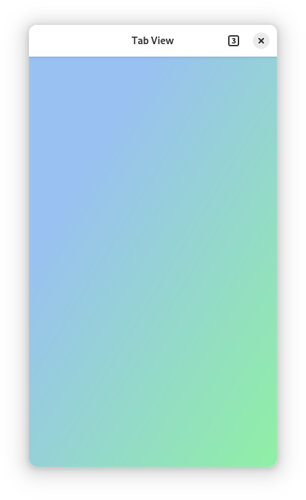
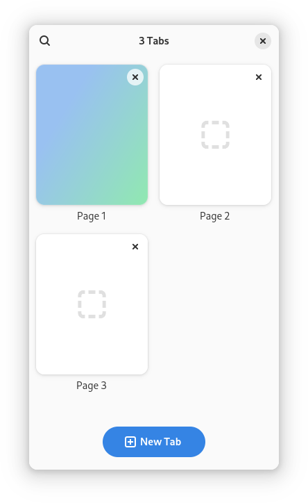
AdwTabView is a dynamic tab container. It doesn’t have a visible tab
switcher on its own, leaving that to AdwTabBar, AdwTabButton and
AdwTabOverview. When used together with breakpoints, these widgets can
provide an adaptive tabbed interface.
<object class="AdwWindow">
  <child>
    <object class="AdwBreakpoint">
      <condition>max-width: 500px</condition>
      <setter object="overview_btn" property="visible">True</setter>
      <setter object="new_tab_btn" property="visible">False</setter>
      <setter object="tab_bar" property="visible">False</setter>
    </object>
  </child>
  <property name="content">
    <object class="AdwTabOverview">
      <property name="view">view</property>
      <property name="enable-new-tab">True</property>
      <property name="child">
        <object class="AdwToolbarView">
          <property name="top-bar-style">raised</property>
          <child type="top">
            <object class="AdwHeaderBar">
              <child type="end">
                <object class="AdwTabButton" id="overview_btn">
                  <property name="visible">False</property>
                  <property name="view">view</property>
                  <property name="action-name">overview.open</property>
                </object>
              </child>
              <child type="end">
                <object class="GtkButton" id="new_tab_btn">
                  <property name="icon-name">tab-new-symbolic</property>
                </object>
              </child>
            </object>
          </child>
          <child type="top">
            <object class="AdwTabBar" id="tab_bar">
              <property name="view">view</property>
            </object>
          </child>
          <property name="content">
            <object class="AdwTabView" id="view"/>
          </property>
        </object>
      </property>
    </object>
  </property>
</object>
Multi-Layout View
AdwMultiLayoutView defines multiple layouts and allows switching between
them. Each layout has slots inside it, and when switching layouts, children are
inserted into slots with matching IDs. Breakpoints can be used for switching the
layout depending on available size.
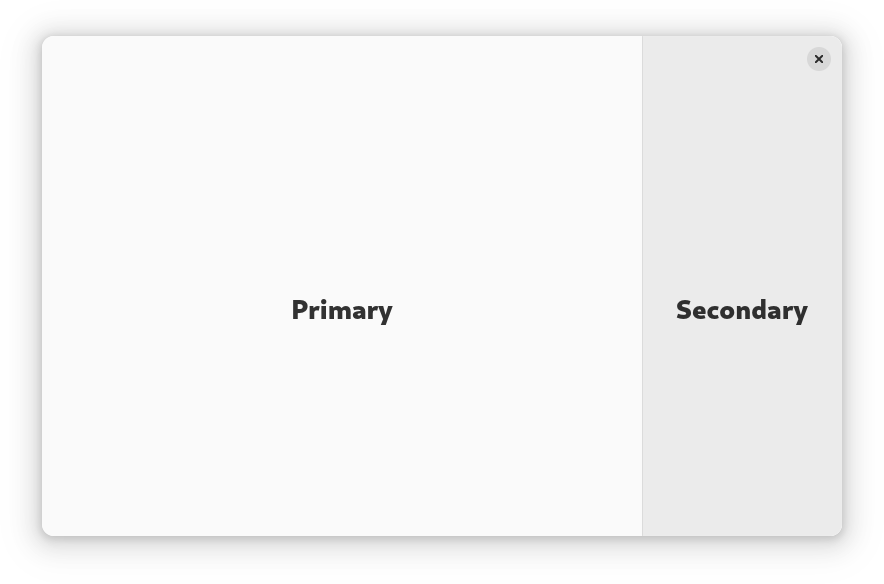
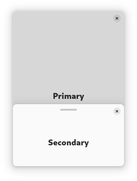
For example, it can be used to have a sidebar that transforms into a bottom sheet on narrow sizes, as follows:
<object class="AdwWindow">
  <child>
    <object class="AdwBreakpoint">
      <condition>max-width: 400sp</condition>
      <setter object="multi_layout_view" property="layout-name">bottom-sheet</setter>
    </object>
  </child>
  <property name="content">
    <object class="AdwMultiLayoutView" id="multi_layout_view">
      <child>
        <object class="AdwLayout">
          <property name="name">sidebar</property>
          <property name="content">
            <object class="AdwOverlaySplitView">
              <property name="sidebar-position">end</property>
              <property name="sidebar">
                <object class="AdwLayoutSlot">
                  <property name="id">secondary</property>
                </object>
              </property>
              <property name="content">
                <object class="AdwLayoutSlot">
                  <property name="id">primary</property>
                </object>
              </property>
            </object>
          </property>
        </object>
      </child>
      <child>
        <object class="AdwLayout">
          <property name="name">bottom-sheet</property>
          <property name="content">
            <object class="AdwBottomSheet">
              <property name="open">True</property>
              <property name="content">
                <object class="AdwLayoutSlot">
                  <property name="id">primary</property>
                </object>
              </property>
              <property name="sheet">
                <object class="AdwLayoutSlot">
                  <property name="id">secondary</property>
                </object>
              </property>
            </object>
          </property>
        </object>
      </child>
      <child type="primary">
        <!-- primary child -->
      </child>
      <child type="secondary">
        <!-- secondary child -->
      </child>
    </object>
  </property>
</object>
